• Skip navigation and go to content
  • Go to navigation

Norman Rockwell Museum

  • Visit
    • Hours & Admission
    • Directions
    • Exhibitions
  • Learn
    • Programs
    • School Programs
    • Curriculum Lab
  • Research
    • Norman Rockwell Collection
    • Archives and Library
    • Rockwell Center for Americal Visual Studies
    • IllustrationHistory.org
    • Frank Schoonover Collection Raisonné
  • Donate
    • Make a Gift
    • Become a Member
  • Shop
  • Calendar
  • Contact
    • Staff Directory
    • Norman Rockwell Museum e-newsletter sign-up
    • Careers
    • What's my Rockwell Worth?
      FAQ

Illustration History

  • History
  • Artists
  • Genres
  • Essays
  • Resources
  • Podcast
  • History
    • Time Periods
  • Artists
  • Genres
  • Essays
  • Resources
  • Podcast
Home > Illustrations > interior of landscape greeting card

interior of landscape greeting card

By Thomas Crane | Created: 1880

interior of landscape greeting card
Medium
  • color lithograph
Support
  • Paper
Illustration Size
  • Unknown
Collection
  • Peter Wadham

©Public Domain

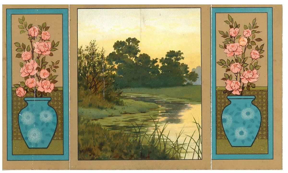
"To this period also we owe the singularly felicitous decoration of the backs and borders of the cards which Mr. Thomas Crane designed so excellently well. In the colour of these, the simplicity of their flat ornament and the artistic fitness, I, for one, find the high water-mark of the card."

excerpt from "Christmas cards and their chief designers," The Studio, by Gleeson White, pg. 8

"...in the 'Marcus Ward' cards, especially in the middle or later periods, there is sign of one consistent supervision - and this undoubtedly is largely, if not wholly, traceable to the presence of Mr. Thomas Crane in the firm as director of its department of design. This artist, brother to Mr .Walter Crane, had the courage to send out to a public that, again and again, shows its indifference to 'conventional' design, a series of cards which - quite apart from the excellence of their pictures, or floral devices - were embellished by most refined and appropriate ornamentation on their borders and backs. The lettering was not left to chance, or reduced to the bare simplicity of a label in ordinary type, obviously an addition to the design, but was planned to accord with it. The colours which distinguish this class of decoration are unusually happy. Pale blue lettering on sage green ground, citrons, olives, and tertiary colours were employed much as they were used by the so-called aesthetic school of furnishers of the same period. Without being unduly 'precious,' or confined to esoteric symbolism and 'Grosvenor-gallery' figures, they did attempt to observe the canons of conventional design."

excerpt from "Christmas cards and their chief designers," The Studio, by Gleeson White, pg. 17

Genres
  • Decorative & Applied Illustration
Global Perspectives
  • Europe
Related Time Periods
  • Late 19th Century Late 19th Century

Support the Project

We need your help to keep this project alive and growing. How can you help?

Submit Work
Make A Donation
About The Project

Stay Informed

Join our mailing list to receive updates about this growing project.

Art Works. National Endowment for the Arts. arts.gov

This project is supported in part by an award
from the National Endowment for the Arts.

"The great band of illustrators have shown us to ourselves and I am proud to be among their company."
- Norman Rockwell

©Copyright 2020 Norman Rockwell Museum
9 Route 183, Stockbridge, MA 01262 | 413.298.4100
Privacy Policy | Terms and Conditions